How To Create A Combo Chart In Excel: A Comprehensive Guide
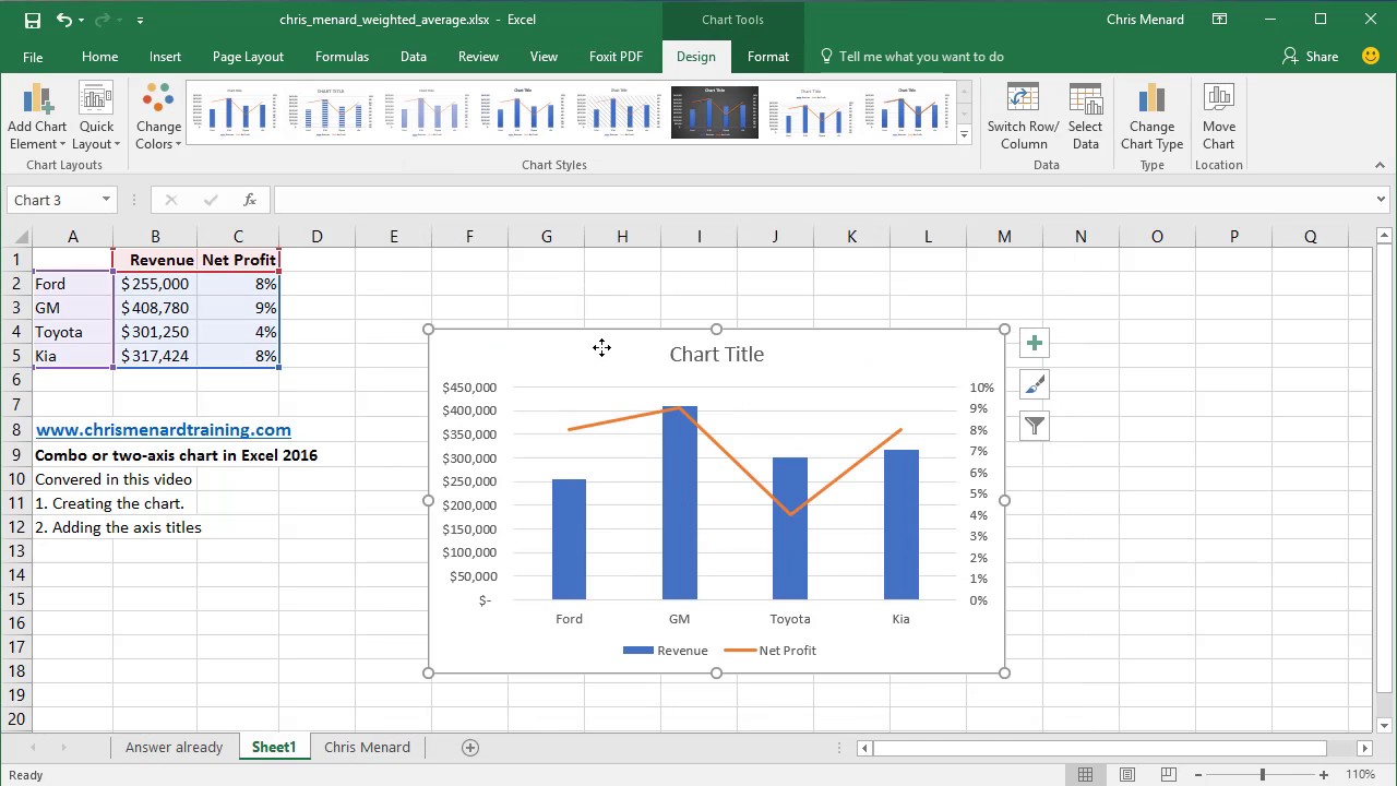
Are you looking for an easy and effective way to visualize complex data in an Excel spreadsheet? If so, a combo chart may be the perfect solution for you. A combo chart, also known as a combination chart, is a type of chart that combines two or more chart types in a single chart. This allows you to display multiple data sets in one chart, making it easier to analyze and compare data points. In this guide, we’ll discuss what a combo chart is and how to create one in Excel.
What is a Combo Chart?
A combo chart, or combination chart, is a type of chart that combines two or more chart types in a single chart. This allows you to display more than one type of data in the same chart, making it easier to compare different data points. For example, a combo chart can be used to compare sales numbers over time, or to compare the performance of different products. By combining multiple chart types in a single chart, you can quickly and easily visualize complex data in a single visual.
Types of Combo Charts
There are several types of combo charts that you can create in Excel. The most common type is a column and line combo chart, which combines two different chart types in a single chart. This type of chart is useful for comparing different types of data, such as sales numbers and revenue over time. Other types of combo charts include bar and line combo charts, pie and line combo charts, and scatter and line combo charts.
Advantages of Using a Combo Chart
Combo charts offer several advantages over traditional charts. They allow you to clearly compare multiple types of data in a single chart. For example, you can use a combo chart to compare sales numbers and revenue over time, or to compare the performance of different products. Combo charts also make it easier to identify trends and patterns in data. This can be particularly useful for data analysis and decision-making.
How To Create A Combo Chart In Excel
Creating a combo chart in Excel is a relatively simple process. To get started, open the Excel spreadsheet that contains the data you want to chart. Then, select the data you want to chart and click the “Insert” tab. From the “Charts” menu, select the type of chart you want to create. For example, if you want to create a column and line combo chart, select “Column and Line” from the menu.
Once you’ve selected the chart type, you can customize the chart. To do this, click the “Design” tab and select the “Change Chart Type” option. On the “Change Chart Type” dialog box, you can select the types of chart you want to combine. For example, if you want to combine a column and line chart, select “Column” from the left-hand side and “Line” from the right-hand side.
Once you’ve selected the chart types, click “OK” to apply the changes. You can then customize the chart further by adding labels, adjusting the colors, and adding a legend. You can also customize the axes to display different types of data. For example, if you want to display sales numbers and revenue on the same chart, you can customize the x-axis to display sales numbers and the y-axis to display revenue.
Conclusion
Creating a combo chart in Excel is a simple process that can help you quickly and easily visualize complex data. By combining two or more chart types in a single chart, you can clearly compare different types of data and identify trends or patterns in your data. With a few simple steps, you can create a powerful and effective combo chart in Excel.

Image :
youtube.com
Detail Insight Video
If you're wanting to know more about the theme covered in this article, I suggest watching the video below. In this footage, you'll obtain extra perspectives and information on the matter, as well as a visual representation of some of the main ideas and concepts covered in the piece. You'll also have the occasion to hear from professionals in the area and interact with like-minded viewers who are curious in the same subject. Whether you're hoping to enhance your comprehension of the matter or simply wish to discover it further, this footage is a helpful resource for anyone interested in learning more. So, if you want to acquire more in depth insights of the theme, make sure to view the linked video. It's sure to give you the insight and information you want to broaden your knowledge and expertise.
In conclusion, About this topic How To Create A Combo Chart In Excel we hope that you will find the information presented helpful and beneficial. We realize that the world is continuously changing, and keeping up with current developments could be challenging. That's why our mission is to offer you with the most information available. Your opinions is crucial to us, thus please do not hesitate to leave your thoughts in the comments section. Thank you for your readership and encourage you to browse other posts on our website to broaden your perspective even more. Thank you for being a valued reader of our community!
Post a Comment for "How To Create A Combo Chart In Excel"